MOR=) It is a successful campaign to promote protect our earth. It is not only just a action on 28 Mar, but the extension action in the future and remind people to protect the earth. This function does advertising that has a wide channels. Theme song, TVC, and using facebook and youtube to promote as mainly. Also, setting the photo taking competition to encourage people to focus on the campaign. Think more about how this function success. Think more how to save our world. I will take part on this activities. Please take part on this activities and like the ad say "一人一力量".
MOR=) My research of final project. A beautiful website about cakes cupcakes cookies. The cakes cupcakes cookies are very in details. And it always uses some famous cartoon characters as the theme. Quite cute and having its own selling point.
MOR=) Sorry about that I love to update once of the blog. A huge updated. But I still read the passage and ad everyday. Just lazy to update in blogger. Hope all of you love the content of the blog.
MOR=) Selling how the Benz intelligent. It owns beauty and smart. But i think that woman really stupid in this ad. Order food in library.=P For selling cars, the ad can be much more beautiful. The view does not attract me so much.
Version 2 MOR=) In our group project, one of my job is doing logo opening. So simple about the logo opening but a good try to doing motion graphic. Interested in doing motion graphics. Patrice more and do better. This are two version. Logo appearing at the back is a little bit different. But the sound effect is not good. I don't know why><>
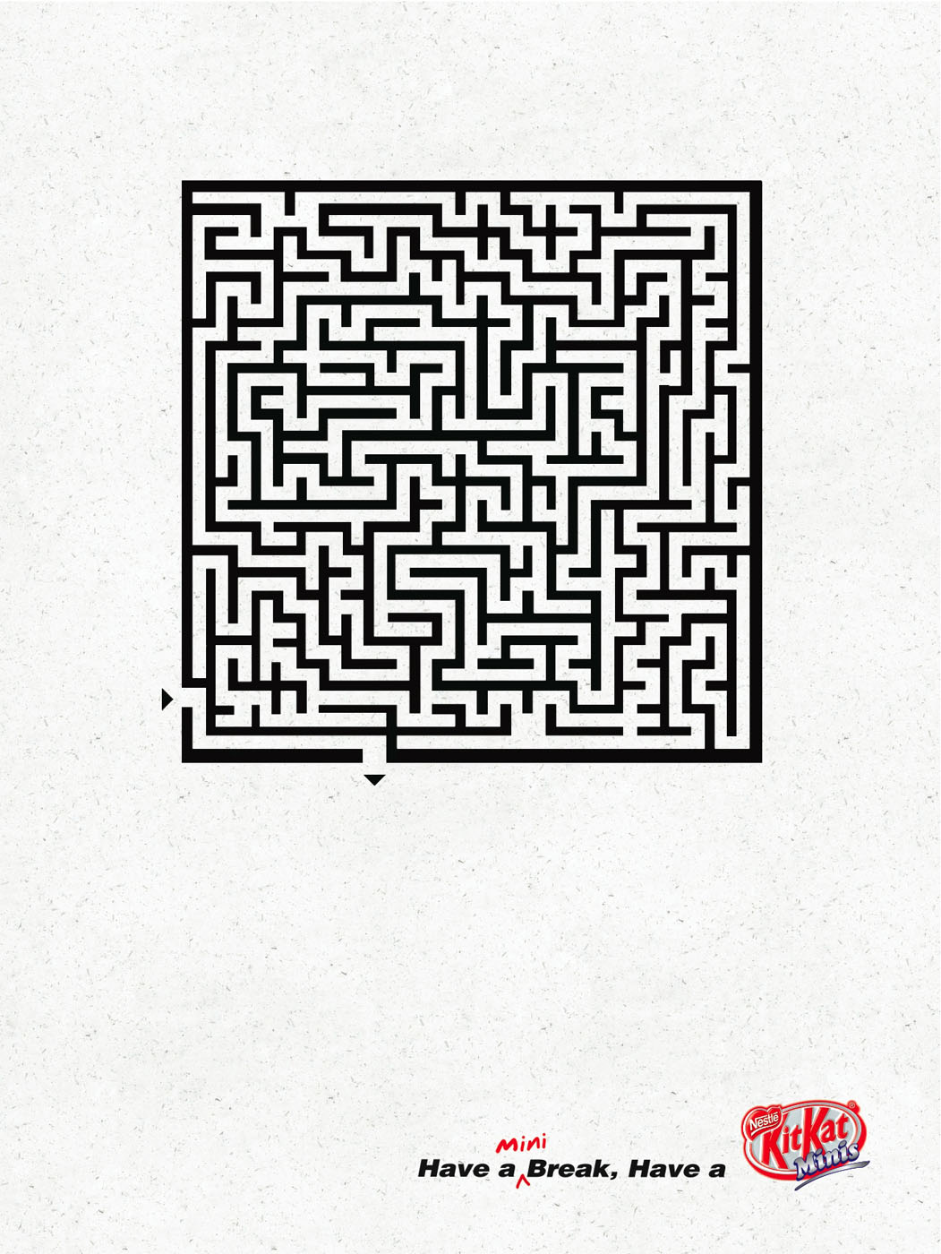
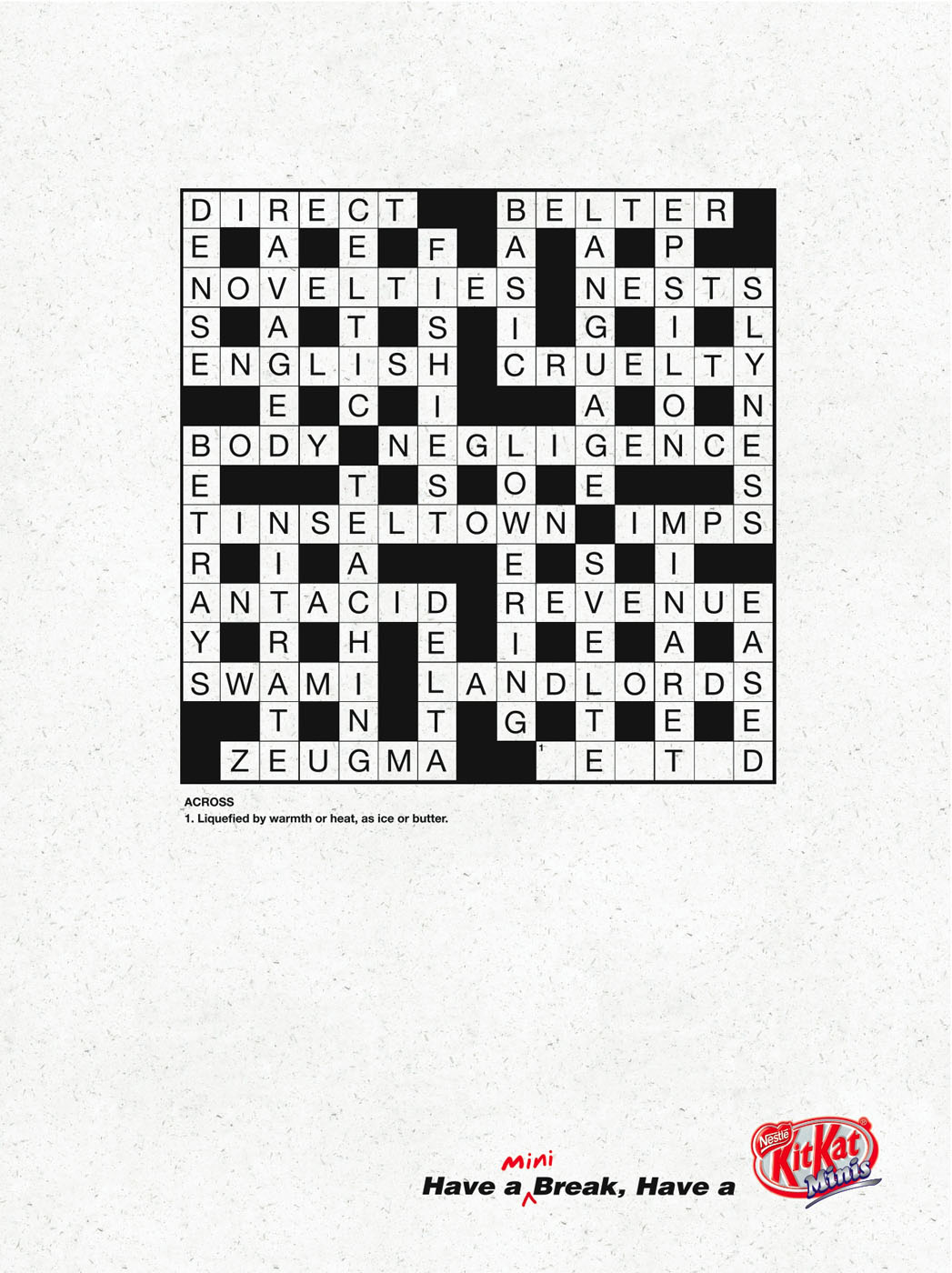
MOR=) Mini break that is playing some mini games. It uses denotation. The images are less but the point is unique and clear. Also, the break is extremely mini. Just fill in a few words and draw a line. In the little time that you can enjoy in your time.
MOR=) BlackBerry Bullet Shows Apple Who's Boss! An ad of "BlackBerry VS Apple". At first, I cannot get the message about against of Apple... until see the title. It shows that BlackBerry so strong. (=P) And it emphasis they are the first touch-screen and no one can touch it. So clear of the message that no one can replace the status. But I still like "Apple"...smart brand=)
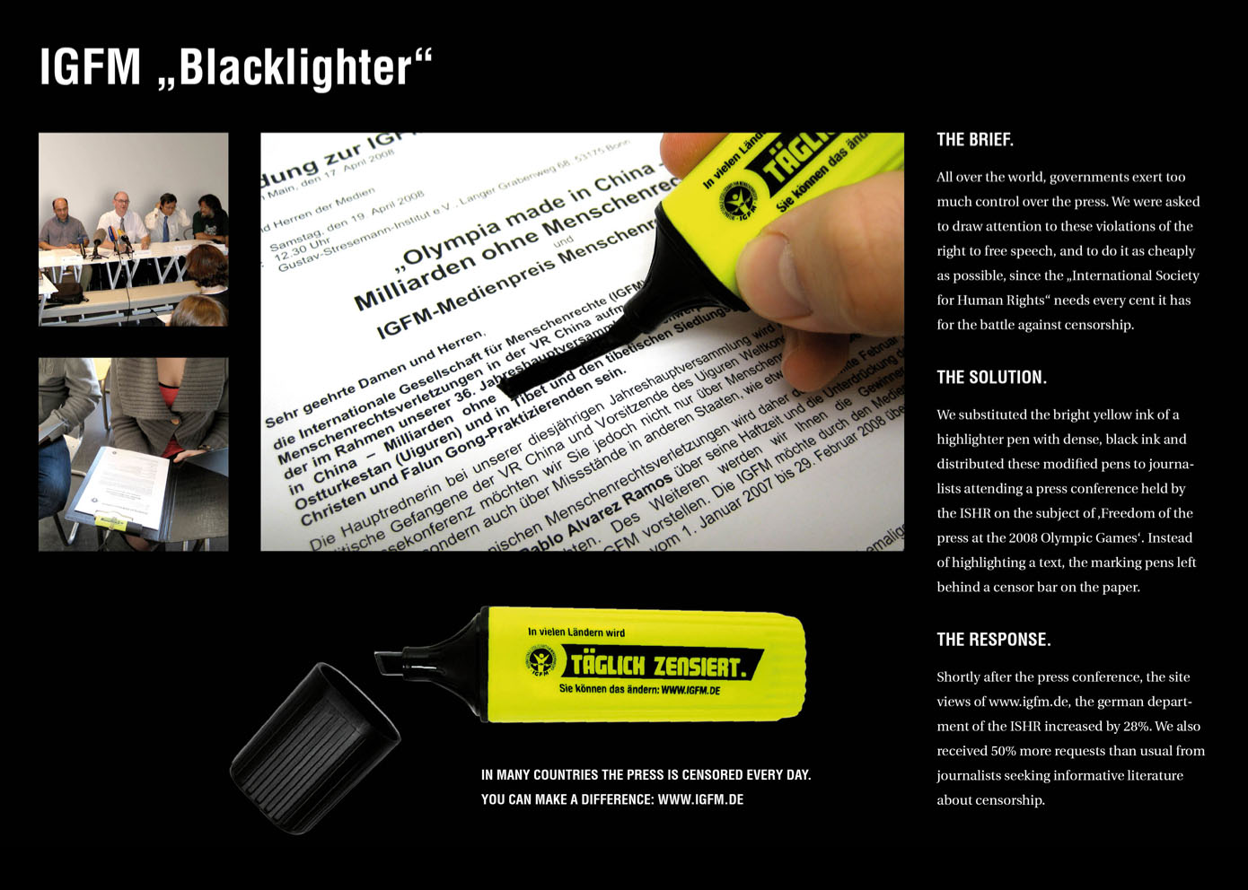
All over the world, governments exert too much control over the press. They were asked to draw attention to these violations of the right to free speech, and to do it as cheaply as posible, since the “International Society for Human Rights” needs every cent it has for the battle against censorship. They substituted the bright yellow ink of a highlighter pen with dense, black ink and distributed these modified pens to journalists attending a press conference held by the ISHR on the subject of ‘Freedom of the press at the 2008 Olympic Games’. Instead of highlighting a text, the marking pens left behind a censor bar on the paper. Shortly after the press conference, the site views of www.igfm.de, the german department of the ISHR increased by 28%. They also received 50% more requests than usual from journalists seeking informative literature about censorship.
“In many countries the press is censored every day. You can make a difference: WWW.IGFM.DE”
Advertising Agency: Jung von Matt/Alster, Germany Creative Directors: Armin Jochum, Deneke von Weltzien, Christian Fritsche, Thim Wagner Art Director: Maximilian Rieder Copywriter: Fabian Königer Illustrator: Marcel Grein
MOR=) Not totally understanding Human Rights, but this ad let me interested in it. The blacklighter wants people to focus what is improtant. When you highlight something, that means you miss something for others. Don't know about the politics, try to understand this ad.
Advertising Agency: N=5, Amsterdam, The Netherlands Creative Team: Marco de Jong, Thijs Bontje, Jurriaan Noij
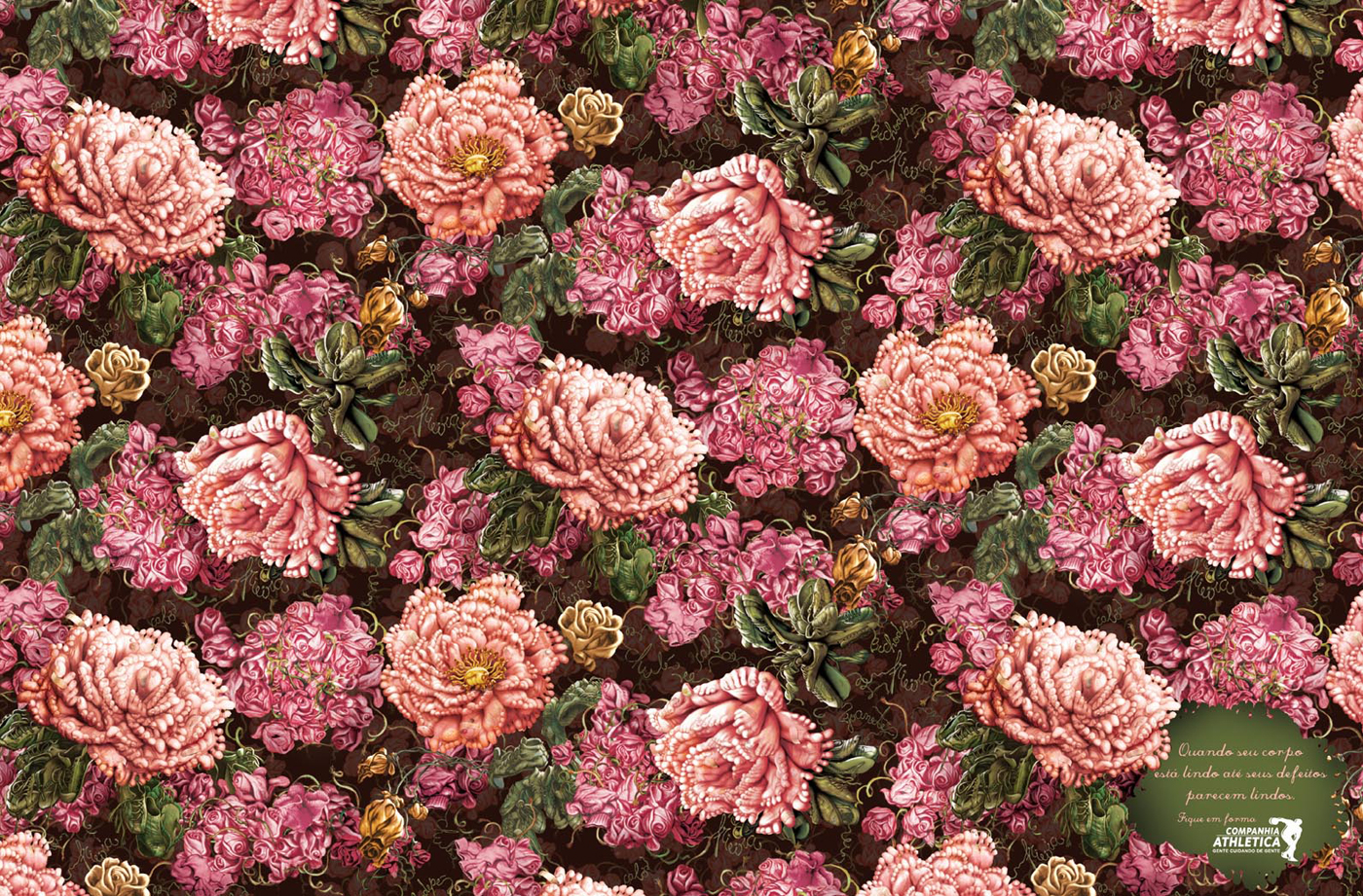
MOR=) I don't want to see my kilograms in a bus stop=) Need to fitness yourself. A extremely advertising to women and ladies. If you see your kilograms in you bus stop, what do you feel? Horrible ad. (HAHA)
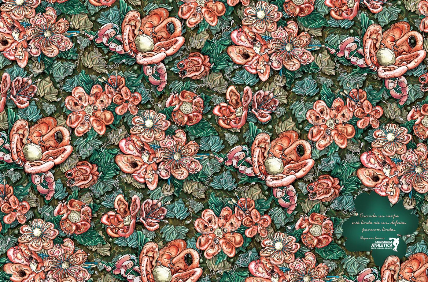
“When your body looks beautiful, even your flaws look beautiful.”
Advertising Agency: DDB Brasil, São Paulo, Brazil Creative Directors: Sérgio Valente, Rodolfo Sampaio, Julio Andery, Guilherme Jahara, Marcelo Reis Art Director: Guilherme Jahara Copywriter: Marcelo Reis Illustrators: Luciano Lagares, Estudio Open The Door
Click the pictures and see the bigger one... It will surprise you!!!
MOR=) Using noses, ears and feet to make the flowers. Clearly, it uses the connotation and exaggeration. The statement shows how people get beautiful and the visual need to close up and see it is not the flowers but noses, ears and feet. Maybe it can claim as as...if... Flaws as beautiful as bodies. Maybe.
The School of Design is at the forefront of applying Asian innovation to global opportunities. We are committed to sustain excellence in design education, practice, consulting and research; to harness the legacy and dynamism of Asian cultures in creating solutions for human needs; and to create strategic models for products, brands, and systems in local and global markets.
SD History in 2000s
2001 Higher Diploma in Product Innovation Technologies offered Self-financed Diploma in Design offered MSc in Multimedia and Entertainment Technology co-offered with Multimedia Innovation Center
2004 First launch of Master of Design (MDes) program
2005 Multimedia Innovation Center became part of School of Design
2006 First games production services unit named MERECL launched Partnered with Graduate School of Business in offering MBA program in Innovation and Design Management Rated one of the Top Design Schools in the world by BusinessWeek magazine
2007 SDWorks was established to develop student designs for commercialization First SD Design Month launched to raise public awareness for student’s and alumni’s creative talents MDes program expanded to offer specialisms in Design Practices, Design Strategies, and Interaction Design Second year rated as world’s Top Design School by BusinessWeek magazine
Vision
To establish the School of Design as a top tier international design school, applying Asian innovation to global opportunities.
Missions
* To sustain excellence in design education, practice, consulting and research. * To harness the legacy and dynamism of Asian cultures in creating solutions for human needs. * To create strategic models for products, brands and systems in local and global markets.
Core Values
* Humanistic design * Mastery of making * Strategic thinking * Creative and critical engagement * Envisaging design as processes * Sustainability * Sensitivity to history and culture * Cross-disciplinary collaboration * Clarity and conviction in communication
MOR=) Know more about Polyu=) I just see more information about polyu so sharing in here. You both can check it from the official website and see more. Add oil with you dreams and objectives!!!
“270,000 trees are flushed down the toilet or end up as garbage every day around the world. Use tissues sparingly.”
Advertising Agency: DDB, Muscat, Oman Creative Director: Mahesh Anvekar Art Director: Pravin Amudan Copywriter: Santu Sakar Graphic Designer: Nilesh Ayare
MOR=) This ad uses connotation and as...if The content of the message is clearly stated in the words. Using less toilet paper and save trees. The form can remind people that people can feel need to crop the trees.
MOR=) Many beautiful graphics inside the website. The second link has some stop motion and motion graphics. This is the campaign of celebration of Adidas Original brand. The theme is very clear and the selling point is using the House Party as main concept. In Hong Kong's part, also invite some idols to crossover. Xanga and Facebook are the media channels since I see this link in Xanga.